Upcoming UX Improvements to CheckoutWithCard

We'd like to share some of the upcoming user and developer experience improvements to our NFT Checkouts product.
These improvements will go live on Friday, 28th April.
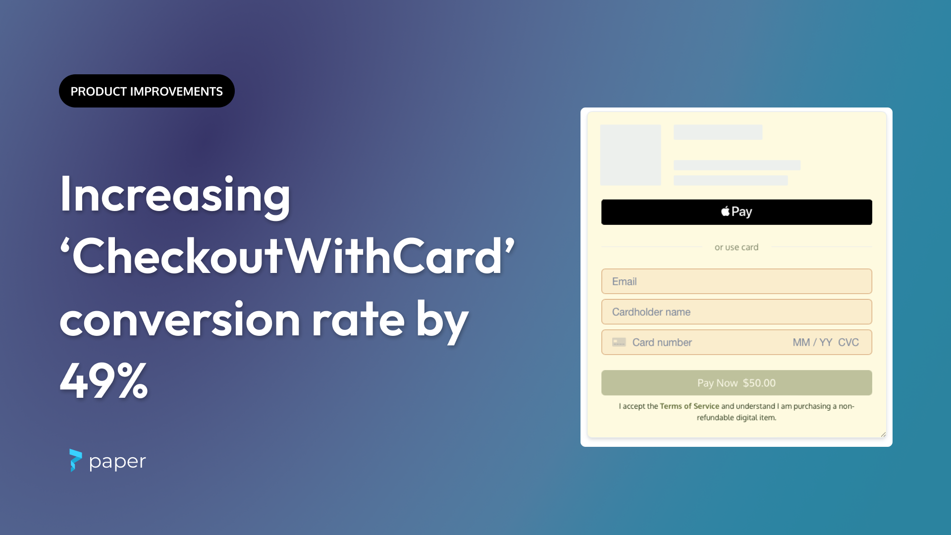
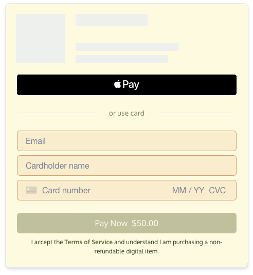
'CheckoutWithCard' now appears on a single page
We've consolidated the card checkout from two pages to one. So far, this change has led to:
- 49% increase in conversion rate
- 44% decrease in median time to fill out the form (45 secs → 25 secs)
Here's what the updated form looks like:

Note: If you manually added the Paper logo to the checkout page, this is no longer necessary. Please remove it so that you don't have duplicates.
Buyers are charged after the NFT delivery
We now charge a buyer's card after the NFT is securely in their wallet. If the mint fails for any reason (misconfigured checkout, sold out, not allowlisted), the buyer won't be charged. This means no more tying up customer funds or manual refunds!
Other UX improvements
- Noticeably faster page loads
- More predictable Apple Pay popup behavior
- More reliable 3D Secure popups
- Improved support for smaller screens
- Improved input validation and error messaging
Will this break my existing integration?
No steps are required on your side. Please confirm if the added height works with your app.
Again, this will be the default experience for all card payments by April 28th.
We've also improved our developer experience
email is no longer a required argument when rendering the credit card form. If omitted, we'll prompt the user for it (and they won't need to leave the page to verify it). And buyers using Apple Pay/Google Pay can skip this step entirely.
Some of you provided an eligibilityMethod to minimize the likelihood a user is charged for an item they can't mint like an allowlisted presale NFT. Now that cards aren't charged until a successful mint, this step is redundant and can be safely skipped.
And for those who want to display the price breakdown on your app, the latest SDK includes an onPriceUpdate callback that provides a price summary including fees for you to build that pixel-perfect UX.
What's next?
We have a series of user-facing and developer-facing improvements in the upcoming weeks as we continue to iterate on building the best embedded checkout experience. Stay tuned!
